
You are reading the Audit Series
The Audit Series covers every single critical user interaction you will have on your website. The series will investigate each specific interaction in full depth, providing you with an understanding on the psychology behind each interaction, and actionable steps one can take to kick ass and chew bubble gum.
The series will not just be conjecture, but be the summary of real life experience across millions of visitors.
Join the SJO.com Family at the end to make sure you don’t miss a single article.
I’m sure you’ve heard the phrase “strike when the iron is hot.”
I see entrepreneurs agonizing over email optins, funnel sequences, product offers, and so on.
Yet they totally gloss over one of the most important pages to focus on: the thank you page!
The moment when someone agrees to give you their email (a non-trivial moment) is the moment when they are incredibly receptive to what you have to say.
Don’t miss this opportunity.
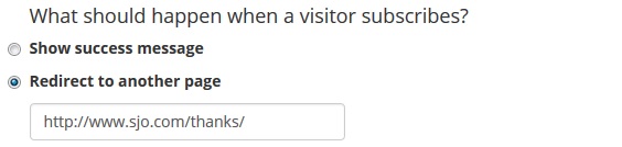
What is a thank you page?
It is incredibly important that after someone opts in, you send them to a thank you page (and not show them a thank you message).
Remember, you have to think of your site in terms of user flow. Once a user opts in and sees your “thank you message”… what’s the next step for them? You are leaving your user stranded without a “next” thing to do.
It is of critical importance that a user always be given a call to action (CTA) is. So give them one!
Mind you, thank you pages are not only for when someone opts in. My mother taught me to show appreciation to everyone who does something nice; you should also say thank you after someone purchases from you or even contacts you.
Thank you pages let you continue a user down the path towards purchasing from you.
Why is it important?
People think that the hard work is done when you’ve gotten their email. Wrong.
I love comparing email marketing with dating. Getting their email address is akin to getting their phone number. It’s just the start…
When someone gives you their phone number, they are telling you they want to hear from you. The thank you page is the first message that person hears. It sets everything up. Be too aggressive, and the relationship is over. Be too passive, and they may be left bored.
Just having a thank you page already puts you ahead of the pack. A lot of market leaders totally drop the ball on showing appreciation to their customers. By having one, you’re showing them that you care about what they bring to the table. This creates a stronger sense of engagement between your user and your brand.
An engaged user will yield you more sales, and there is no better way to engage someone than when they optin.
A thank you page shows appreciation, which results in a user who is more interested in your message, which results in better conversions.
Do not forget – your thank you page is literally the first thing a user sees once they give you their email. It is your chance to floor them with how amazing you are. It’s your chance to BOND with them.
What’s crazy is how most marketers do not even consider a thank you page to be a conversion opportunity (here’s a simple example by Emil of SnackNation on how targeted thank you pages were phenomenal on conversions).
The other thing to consider – your thank you page is the bridge between them entering their email and reading your email. You want to get them excited and hooked on wanting to read your email.
The thank you page lets you bond with your visitor and get them excited.
The flow of a perfect thank you page
So we’ve established what a thank you page is and why it’s so potent. Let’s break down the major elements any powerful thank you page should have.
(For anyone who has ever written a powerful welcome email, you will find striking similarities).
1. Thank them
The first step is to simply thank them (it’s amazing how many people miss this step). Acknowledge the step they took (handing over their precious email to you), and show appreciation.
2. Tell them what they’re getting
Now that you’ve thanked them, you want to let them know what they are getting. It could be some background info a PDF they are getting. It could be information on a free course they signed up. Whatever it is, whet their appetite.
This is your chance to start getting them hooked. By telling them what they are getting, you are setting their expectations (which you will of course deliver on, if not over-deliver on).
3. Help them get started in email
If you have double opt-in, you definitely want to guide them in making sure they actually open the email.
Beyond that, you also want to encourage them who the email will be from and what email it will come from. Give them instructions on how to whitelist your email, and making sure you don’t end up in GMail’s promo tabs (which will kill your open rates… it’s where emails go to die).
A little trick I like is giving them a link to a gmail search so they can immediately get to it! Replace example@sjo-2f9c.ingress-comporellon.ewp.live with your sender-email and use it as the link: https://mail.google.com/mail/u/0/#search/example@sjo-2f9c.ingress-comporellon.ewp.live
4. Give them a next step
This is arguably the thing that most people just completely whiff on.
Remember – in marketing, you’re basically getting your user to give you a small yes, then a slightly larger one, then larger, and so forth until you get them with the sale.
So when they’ve already given you a commitment (their precious email), go for a second request. Once someone has agreed to a small request, 53% will satisfy a second request.
So now that you’ve thanked them, set expectations, and helped ensure they will find your email, have them do something! It could be something as simple as segmenting themselves, to offering them something (free or paid), or anything else in-between.
[convertkit]
The elements of a perfect thank you page
While the previous section outlined the structure of a thank you page, there are also elements to consider:
Establish a human connection
They’ve just opted in. You’re thanking them but being thanked by a robot means nothing. Show who you are and use your brand or your own voice.
By making it personal, you establish a human connection. There’s a reason why you even have someone that is the “face” of a company… it’s because people want to connect with an individual, not a faceless company.
So show off your personality. Show a picture of yourself. Use lingo that will build a connection. Let them connect with a person.
Be consistent in your branding/imaging
One of the biggest things I harp on is that most entrepreneurs run their companies like an amateur league (AML) organization. That extra 2% of being professional makes a huge difference.
So make sure your thank you page – from the graphics to the design to the copy aligns with how the rest of the site is. A consistent style is what people expect, and to change it up suddenly can be jarring. Using the default thank you page from someone like MailChimp makes you look AML.
This is also your chance to use images and video if you want. If you have a website heavy with graphics and art, then use such imagery! It adds to building that connection with them.
As an extension, remember that headlines, colors, and images guide people’s eyes. Have a friend look at your thank you page and ask what they noticed at first.
Be Above the Fold
Almost a part of your branding and imaging, but often times after opting in, a user may think they are done. Make sure all these elements you’ve added aren’t getting lost because a user didn’t realize to scroll down.
Pixel your users
Make sure you pixel your users who end up on the thank you page. With both Facebook and Google, this will let your track your users down the road and hit them with targeted messages.
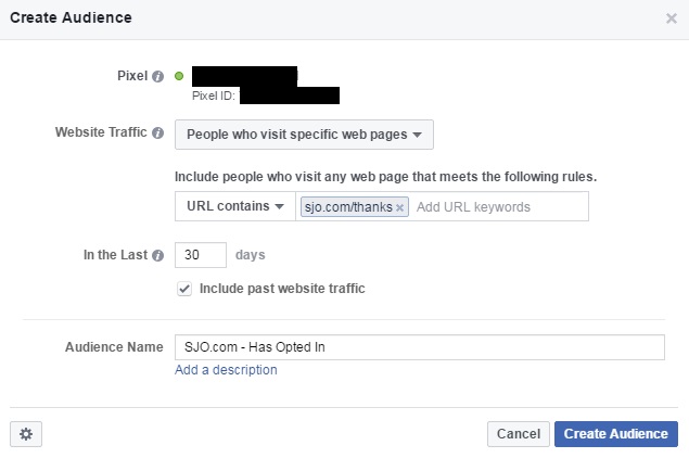
That second CTA we talked about? If they don’t act on it, you can now advertise it directly to them!
Make it a Goal in Google Analytics
If you pay any heed to conversion optimization, you need #s to make sure it’s all being done properly. In Google Analytics, you can then see how people are opting (on the left side, it’s Conversions->Goals->Goal Flow)
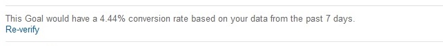
You can see that 4.44% of SJO.com’s traffic is opting in. Not bad considering I use no in-your-face optins.
Social Proof
A great time to hit your (future) customer is with social proof after they optin. Show them the social proof that sets you up as a trusted source, and testimonials of people vouching for what you do.
A testimonial from a well-known figure can really hammer home the point on how amazing you are.
Don’t overwhelm
I’ve outlined a lot of things, and people often take it too far. For example, you don’t need to write 5 sentences to thank them for signing up. Something as simple as “Thanks – I appreciate you joining the SJO.com Family” is more than enough!
BONUS: Don’t forget your goodbye page
If there is a customer touchpoint that is almost always ignored, it’s the goodbye page. Some people will at least put in effort in making the signup process smooth, but it’s rare to see the unsubscribe page not being whatever default your email service provider gives you.
So a few bonus tips on how to optimize your goodbye page:
Don’t leave them annoyed
Make it easy to unsubscribe. Always think about your experience – if you want to unsubscribe, you will. If you make it annoying for them, they may report you as spam, which can hurt your email deliverability.
Ask for Feedback
How could we have improved our service? What caused you to unsubscribe? It could be useful knowledge on how to improve.
Offer Social Media
Often times people unsubscribe because they just feel overwhelmed or are just not as interested any more. So give them to option of following you on social media – it’s a lot more casual of a relationship, and they may be open to it.
Some Examples
I thought it would be fun to take a look at some friends and notable people and see how they do it…
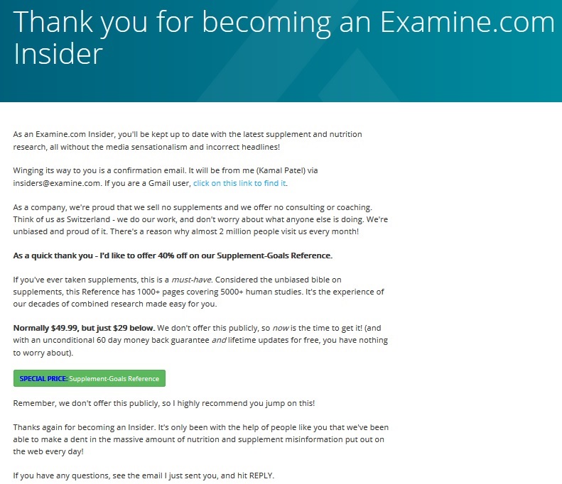
Examine.com pretty much follows it to a T – we thank them, we explain who we are, we help them find the inbox, and then our secondary CTA is selling our Supplement-Goals Reference at a discount. Finally, we close with giving them an easy way to contact us (and making it more personable).
(I talk about how the page converts at the bottom of this post)
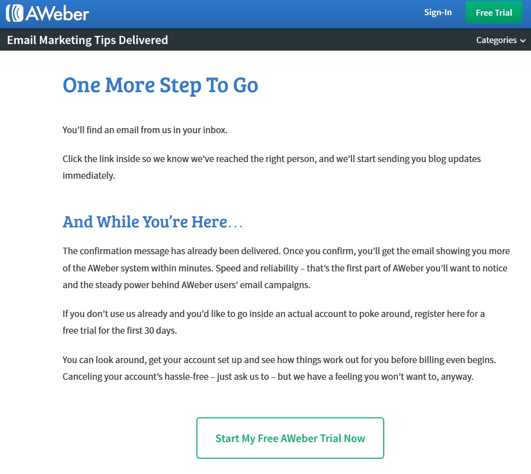
Aweber knows what it’s doing. It’s giving you the next step, pitches who they are, and then gives a secondary CTA. I do think they could say thanks and also show some personality!
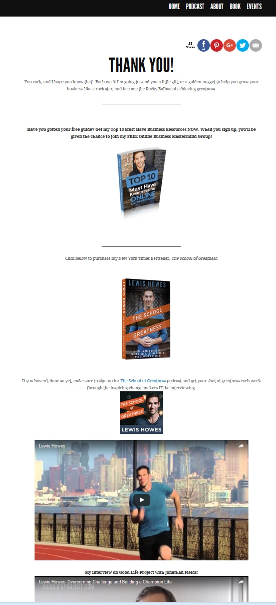
Lewis Howes gets right to it. Thanks them, sets expectations (emails every week… but also gets them excited for it), gives them a freebie, and then gives them multiple ways to consume his content (book, podcast, videos).
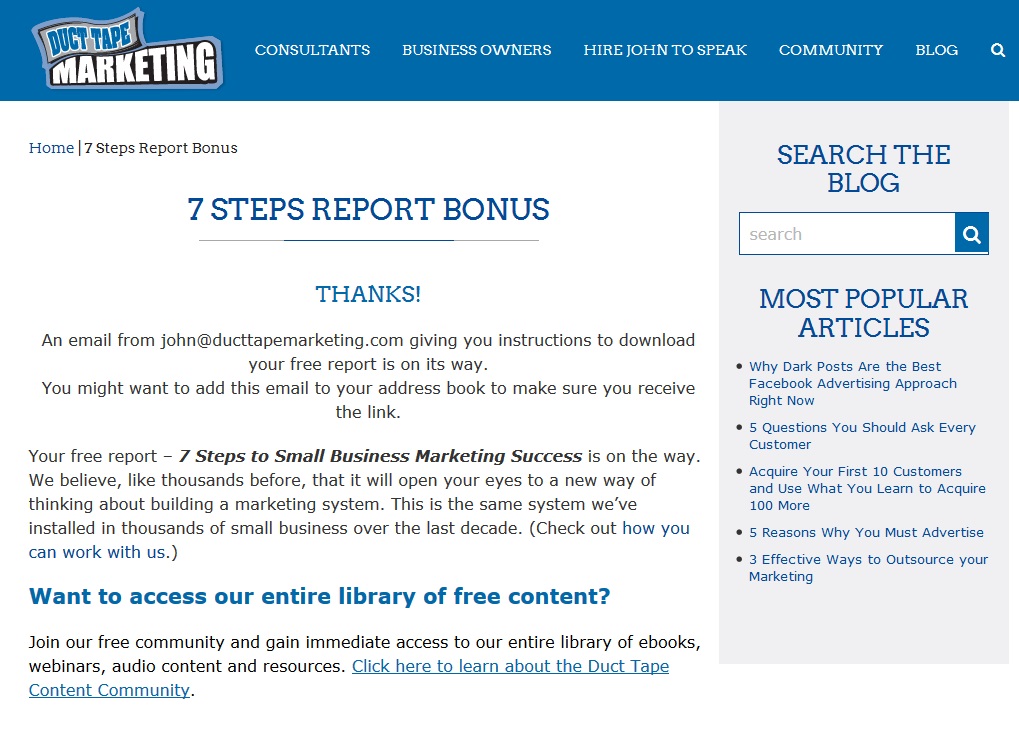
Duct Tape Marketing does it well – they thank them, let them know who the email is coming from, and what they are getting. The secondary CTA is then into their community (which I assume is fantastic conversion for them). I’m not too keen about the right hand menu, but at the same time, it is keeping it in-line with the rest of the design.
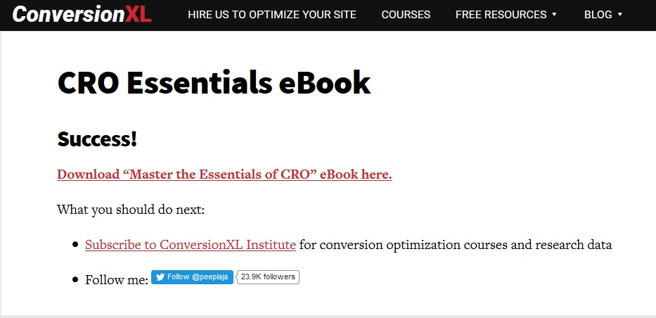
Peep went super simple on ConversionXL. He gave them the freebie and secondary CTAs. I do think he should have been a bit more thankful and show some personality.
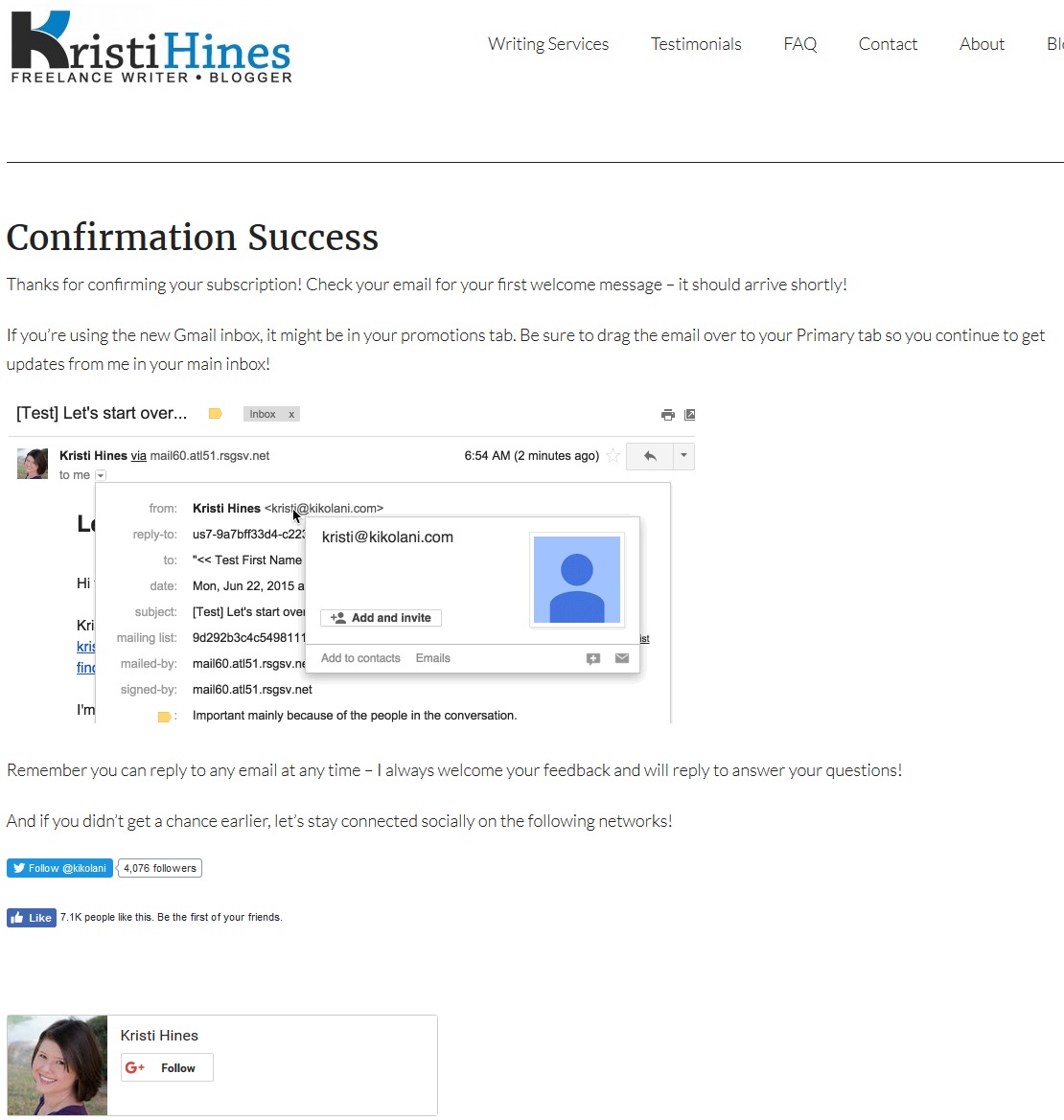
Kristi Hines thanks them, helps them white list, and shows personality (reply any time) before she secondary CTAs them to social media. You can see it fully here, but that image is actually an animated gif. She definitely could have gotten them a bit more excited, and I’m not sure she needs more Google+ followers!
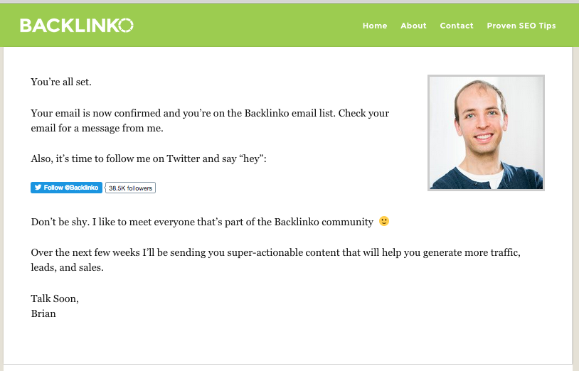
Brian Dean takes a simple approach too. Lets them know he’s sent an email, and then opens up communication (one of the most responsive people I’ve ever met) via a secondary CTA of twitter, and also sets the expectations.
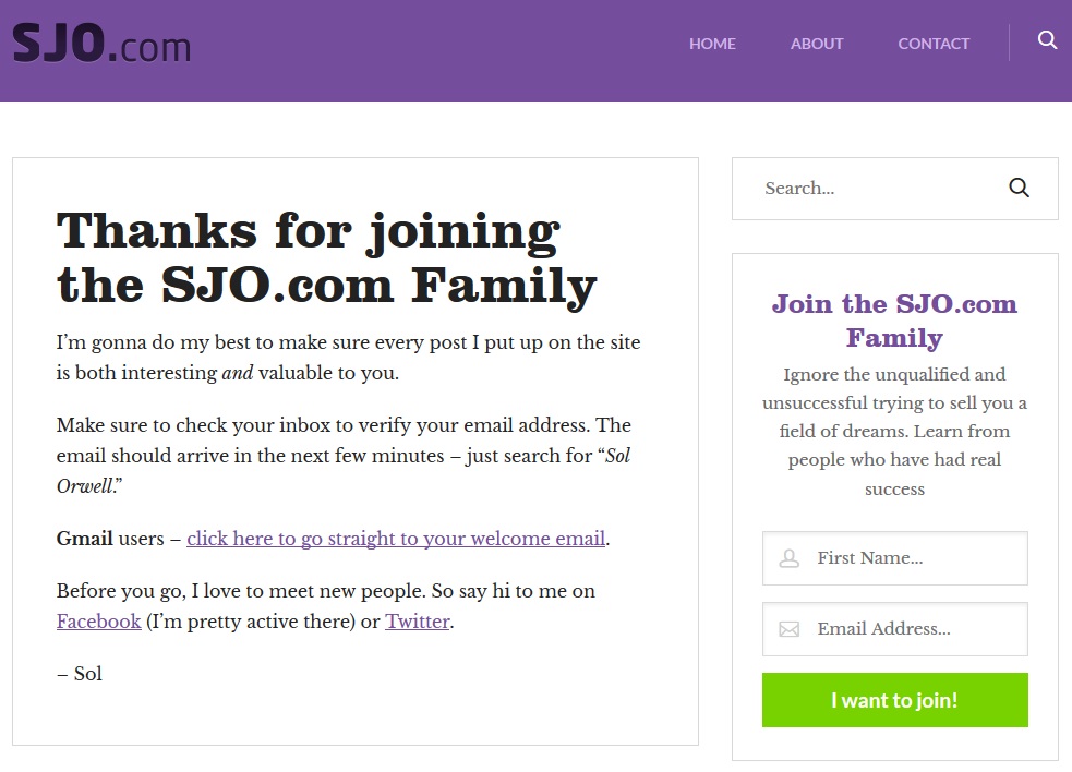
Lets wrap it up with this site. I thank you, get you a bit excited, and let you know an email is coming. And then the secondary CTA is to basically continue the conversation (I obviously post on FB/twitter a lot more than email).
For page-specific optins (like this page has), you also get emailed something of usage.
BUT – we do bad by still having the (via default menu) opt-in on the right side. I need to edit my WP theme and excise that.
Thank you pages come in different forms, but good ones hit the major points.
Thank you page = $$$$
So on our Examine.com Thank You Page, we hit all of the points. Importantly, we also offer them our amazing Supplement-Goals Reference (it’s a beast) at a massive discount. And people click on it and buy!
Over a 5 day period:
- 2654 optins
- 169 clicked (over 6%)
- 27 bought (16% conversion)
- Generated just over $1000 from those optins
This is all before any email sequence to build up a relationship, to show them how amazing we are, to even attempt to sell them anything… we made $0.39 per lead.
From just a Thank You Page.
If you aren’t already figuring out how to update your thank you page, I literally do not know what to say to you…
Leave a Reply