Examine was started back in 2011. Since then, we’ve had tens of millions of visitors. We’ve built up a reputation of trust and authority and an irritating adherence to being nuanced and contextual, rarely ever giving you binary answers.
We started work on Examine v2 back in January 2020, and it was released on August 18 2022.
I asked via email and social media if people wanted me to write about the experience, and I got 50+ emails and messages on what people wanted to learn.
From talking to people, I generated an outline:
- What is v2?
- Customer research and the resetting of our expectations
- Why v2?
- RFP for design
- Growing up as a company
- Lessons learned from our launch
- What does the future portend?
A few quick disclaimers: many things happened in parallel, and we started this before COVID exploded, so my memory may be fuzzy on some details. This is all from my perspective – Kamal dealt with the research side of things, and his experience is likely a bit different.
Finally, if you want to make sure you don’t miss updates, add your email:
[convertkit]
What is v2?
Examine spawned out of /r/fitness as I grew frustrated by people asking the same question over and over without bothering to search if the question had been asked.
I’d see people spend enormous energy answering something basic like “should I take creatine?” only to see the question again 3 days later.
So it made sense to me: why don’t we build a website where we can answer these questions entirely and just link to it whenever someone asked?
A simple solution to an irritating problem.
Since we were just bros trying to get muscular, Examine initially focused on bodybuilding supplements. As we grew, our scope expanded into fitness supplements. Then general health supplements. We eventually expanded beyond supplements to include foods, diets, and lifestyle interventions.
More recently, we’ve expanded our coverage to more esoteric topics such as binaural beats and menstrual cups.
Note that neither of these are supplements. Expanding past supplements and covering a considerable number of indications was getting to be daunting. So we needed to take a step back and ask ourselves two critical questions:
- How do we organize health information?
- How do people look up health information?
#2 is answered via Customer Research.
(I want to reiterate that much of this happened in parallel – a lot of this came from our Customer Research, ).
For the first question, we decided to take a step back and abstract the two main sections of information on our site:
The first one was easy – a supplement is basically a specific type of intervention usually taken orally, can be purchased without a prescription, and can impact your health. Walking is an intervention. Sex is an intervention. Medication is an intervention. Playing with your grandkids is an intervention.
So abstracted out, supplements became one of several types of interventions. Under the umbrella of “interventions,” we ended up with a few obvious ones we cover:
- Supplements
- Diets (keto, Low-FODMAP)
- Foods (garlic, blueberries)
- Misc (the aforementioned binaural beats, menstrual cups)
This level of abstraction means that if we want to expand into exercise – we can. If we want to expand into medication – we can!
We can add and organize anything by treating the inputs that impact your health as an intervention.
The second side is the outputs, aka our health topics. And this is where things started getting messy.
Looking at other sites, pretty much nobody had created any form of hierarchal organization – similar to us, they just vomited out 500+ links and said, “okay good luck finding this out!”
We tried to look at it systematically – how would we organize health topics in a way that links them to each other but also lets us add a layer of “this is what most people care about.”
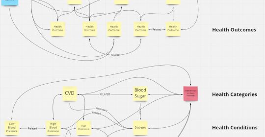
We ended up with three levels of hierarchy:
- Health categories
- Health conditions
- Health outcomes
Examples to illustrate the structure:
- Category: Cardiovascular
- Conditions: High blood pressure, High cholesterol
- Outcomes: Blood pressure, LDL-C, HDL-C
Most people are looking for conditions, whereas outcomes are the nitty-gritty details to track, with the categories being the umbrella term for a collection of conditions.
The beauty of this is there is no strict 1:1 relationship – any condition can be under multiple categories, and any outcome can be under any condition.
Here’s an example of it all interconnecting (click):
In-between all of this is our Study Database (aka HEM right now).
The Study Database is the brain – all studies go in there and then propagate to the rest of the site’s pages. Instead of manually tracking and updating multiple pages, it’s all in one place.
How it looks organized (click):
This subsequently makes updating our pages easier (and faster) as new research comes in.
So what does v2 look like for a user?
(Bear in mind that a fair amount of this came from the customer research).
A user comes to our site and can look up any health topic they are interested in.
At the top of the page, they’ll find a quick overview of the health topic and then see answers to the most frequently asked question – what it is, what causes it, etc.
Next, they’ll find our Study Database (the Human Effect Matrix on the current site), which summarizes the research to know what interventions have what impacts.
Over time, we’ll expand the Study Database and merge our Supplement Guides into them, so the user can quickly look up more detailed information where it is available.
After the Study Database are the Study Summaries, which summarize the latest research on the health topic you are interested in.
And then finally – the more niche frequently asked questions.
And they can do all of this without worrying about us trying to sensationalize or split the page up into multiple pages to generate pageviews (to generate more ad revenue).
No hype; just context and nuance, backed by evidence.
That’s it. That’s v2 – an easy-to-use reference that gives you the information you are looking for, all in one place.
(I posted a preview gif on LinkedIn if you are curious to see it in action)
Before we could make these decisions, we had to understand what our customers wanted. What were they looking for? Why were they looking for it? What outcomes did they want from our site?
I’ll cover that next: Customer research that reset our expectations.
Customer research: understanding why customers hire us
Many years ago, I was lucky enough to meet John Berardi and Phil Caravaggio, co-founders of Precision Nutrition. These guys bootstrapped their company and sold it for over $200,000,000 (Phil was also partially behind the publication of Ray Dalio’s Principles).

When talking to Phil, he often said that JTBD was one of the most important things they ever did as a company.
What is JTBD?
JTBD is short for Jobs-to-be-Done. I’ve written about it a bit more under A business has one job: to solve a problem; the essence is that catering to demographics isn’t nearly as relevant as helping solve the specific job your customer wants to solve.
(You may have heard of the infamous McDonald’s milkshake JTBD).
In 2019, we had two subscription products: Examine Legacy (formerly Examine Plus, which unlocked access to our Study Database) and the Nutrition Examine Research Digest (NERD).
Examine Legacy was the more popular one, netting us hundreds of customers every month.
Around this time, Phil hosted a private seminar with Bob Moesta, who explained the JTBD process and did a live interview.
Between Phil’s exuberant recommendation and seeing Bob in action, I got right to it; we started interviewing our Examine Legacy customers, trying to understand what they really were looking to solve.
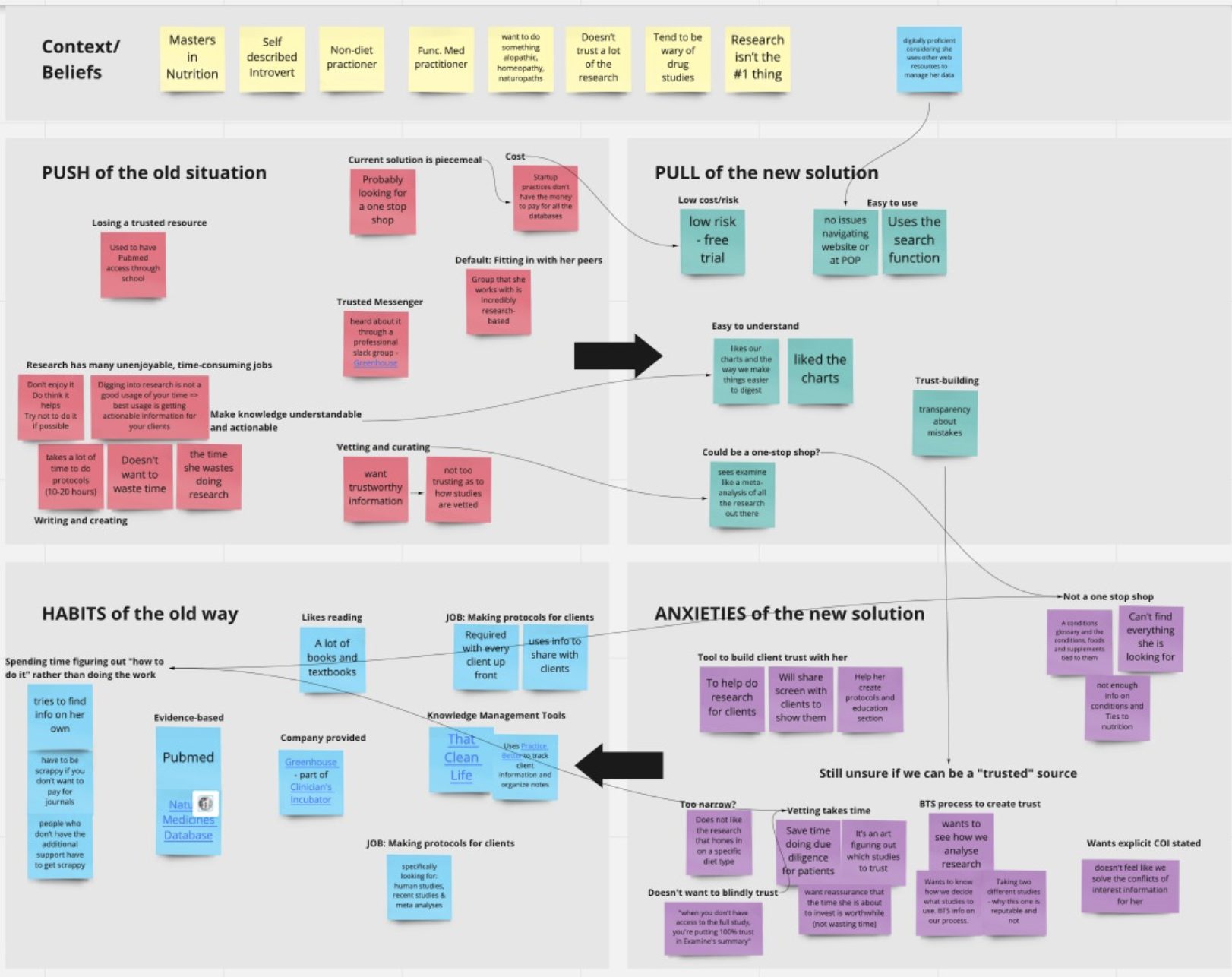
The process of interviews and analysis
The process was simple:
- Identify someone who recently purchased Examine Legacy. It had to be the right balance of “they’ve had enough time to use it” and “it’s still recent enough that they can recall their motivations.”
- Have me get on a call with them. We’d have a few other employees join in on the phone call (which we disclosed), and their job was to listen and come up with potential follow-up questions.
- Talk to them to understand what led them to Examine and what led them to sign up. What were the issues they were facing? How did they discover us? Who are they as people?
- Dig – we didn’t want superficial answers, and we also were mindful that people were trying to help us and give us the answers they thought we wanted to hear! My job was to fully unpack things – “Elaborate on this” “What do you mean by that?” “How would that look to you?” “When you say X, can you break it down?”
- After each interview, debrief with the team to try to identify the themes of:
- Push – what is pushing them away from their current way of doing things (their current solution)?
- Pull – what is pulling them toward us as their solution?
- Habits – what habits have they already built, and how does that inertia impact things?
- Anxiety – what are they worried about if they make the switch?
- We wanted to identify the themes and note their emotions – what got them excited? What made them perk up? What bummed them out?
Our goal was not user experience (though it did come up) – our goal was to understand their motivations and problems so we could solve those. UI and UX were secondary concerns.
Once we had 5-10+ interviews, we could then group them by similarity. Then we started asking ourselves: what common themes emerged, and what did we learn from them?
This was not an easy-breezy process.
Each interview was about 45-60 minutes. We would then take a 10-minute break and then spend an hour organizing our notes and discussing themes and moments and comments of interest in each interview.
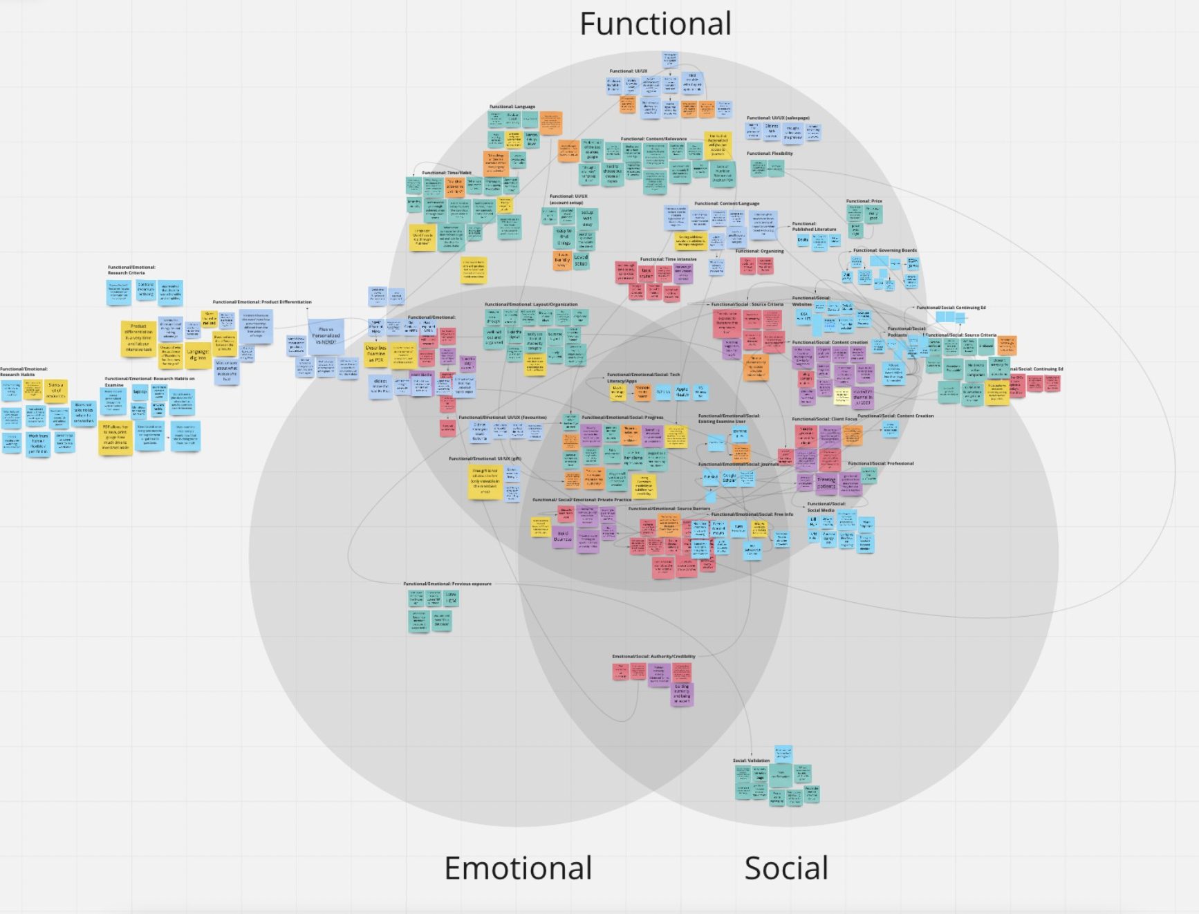
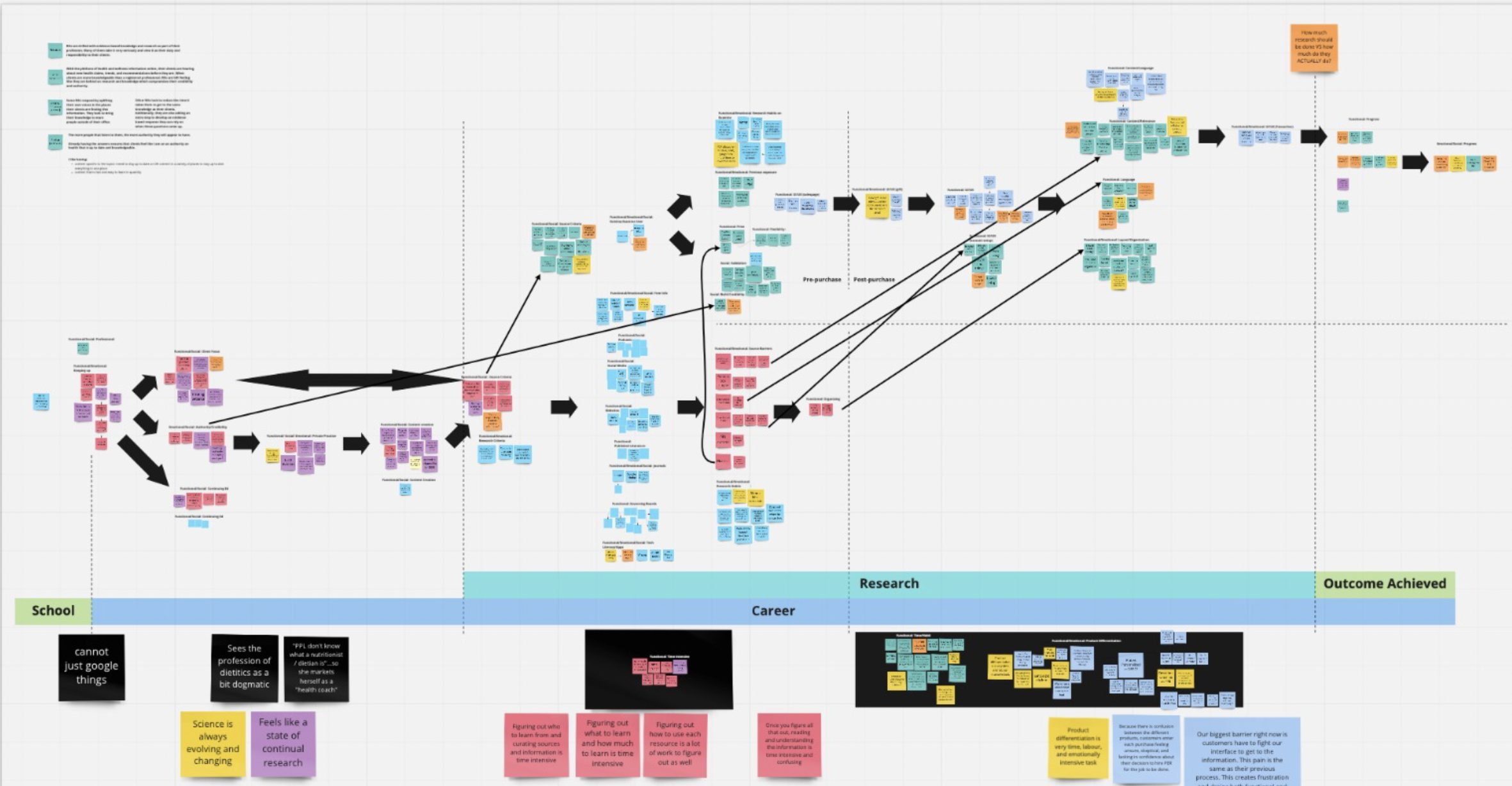
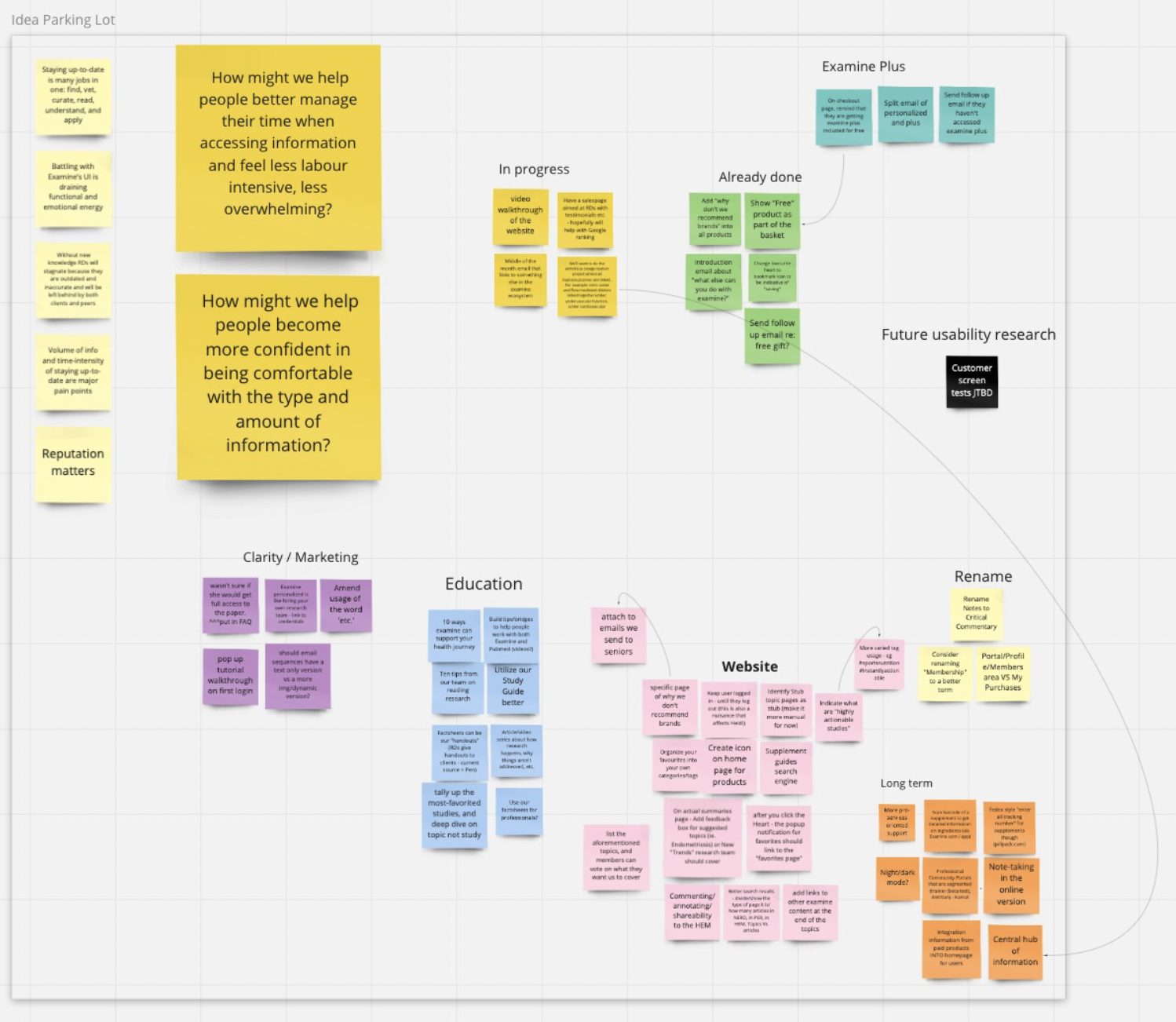
We used miro to organize our information, and here are a few pictures of our work:
The end goal was to understand what our customers were looking for and how we could best give them what they wanted.
Via these interviews, we came to some significant realizations (which collectively led to Examine v2).
A lot of people have chronic conditions and are on medication
One of my incorrect assumptions was that people were interested in supplementation because of a health issue and didn’t want to take medication.
Wrong! (but also not wrong).
Wrong, because a lot of people were already on medication.
Not wrong, because what was happening was medication A would cause side-effect X. Then they would take medication B to deal with side-effect X, but that would then cause side-effect Y.
People were looking for supplements to help alleviate side effects, not solve their primary chronic issue.
When we talked to people, they rarely ever spoke about supplement X or supplement Y. Instead, they would talk about how they had issues with their kidney, how their liver was not working optimally, how they had problems going to the toilet, and so forth.
This led to a straightforward realization:
Most people do not care about supplements – they care about their immediate health conditions.
(This seems so duh in retrospect).
We are a company whose mission is to help you be healthier via research. And if we wanted to help people be healthier, we had to focus on what they focused on: health conditions.
While our site was geared towards supplementation, it needed to be geared towards the health conditions people suffer from.
Supplements may have been our basic “atomic” unit, but we needed to change that to conditions.
As I mentioned in the earlier “What is Examine v2?” section, this is one of our fundamental changes: we made health conditions the focus, with everything else (interventions, FAQs, Study Database, etc) stemming from health conditions.
People have questions, and they want answers
This was our second main realization; again, it seems obvious in hindsight, but whew did we fail here.
From day 1, Examine was built as a repository of information – we dug into the research, crunched it, and then threw it all up online for you to read this overwhelming mass of text.
(aka our Research Breakdown sections).
We soon realized that the Research Breakdown section, while looking impressive, was not very useful. Less than 5% of people ever read it, and I doubt even 1% in total came away with anything useful.
In reality, people learn about health by asking questions; most do not really care about the mechanisms or nerdy details.
If I mention a supplement like ashwagandha, the first thought most people have is “what is ashwagandha?” followed by “what does it do?” and so forth.
People learn by asking questions.
So the subsequent realization:
Drop the Research Breakdown as a monolith and instead spread it across Frequently Asked Questions
We are not a textbook company. People coming to us are not sitting down to read a wall of text to understand everything they can.
As I mentioned, we are a company whose mission is to help you be healthier via research. And if that is our goal, we should talk to you how you would like: by answering your questions (except, unlike most others, we have the references to back up our answers).
Thus, Examine v2 will feature a set of generic FAQs that apply to most health topics and supplements and then a host of esoteric questions that are unique per individual topic or supplement.
For example: does creatine lead to hair loss? Is a migraine dangerous? What causes IBS? What is the connection between diet and high cholesterol?
Answering the questions people ask.
I also want to be super clear – this is not dumbing it down. This is meeting your users where they are – don’t throw a soup of knowledge at them, spoon feed them answers to the questions they care about.
Give people the information they care about
The Nutrition Examine Research Digest (NERD) was a beast. Every month we’d break down 6-10 studies, and each analysis would be 5-10 pages long.
We thought it was awesome, but talking to users, we realized while it was impressive, it was overwhelming!
It was akin to having an 800lb deadlift – very impressive, but honestly, most people don’t care.
Earlier, when I talked about a lot of people have chronic conditions and are on medication, there was a related realization:
Many people only care about the health conditions that are immediately impacting them
There are a bunch of knowledge collectors out there who want to learn everything they can. But for most people, their existing health conditions are a significant enough headache that they don’t have the energy to care about other things.
Someone with diabetes will prioritize learning about blood sugar but often won’t spend a lot of energy on other topics (such as memory, bone health, libido, etc). They have more pressing concerns!
And since NERD covered the gamut, for most people, only 1 or 2 articles every month were of interest (if even). The others were just way too long – it wasn’t a quick read; it was an investment of time!
People would say they loved the idea, but when it came to the reality of reading it, they would balk – this isn’t pleasure reading, it was intense learning!
(This is related to what I said during The Process of Interviews and Analysis – people will try to be helpful, but they won’t tell you the complete truth).
And that was our subsequent realization:
Give people the ability to go deep on the topics they want.
This is where our categorization started coming into play. How can we give users precisely what they want? How can we give them study summaries without overwhelming them?
So we created an overarching set of categories (25) and vastly simplified our summary format to only hit the essential points:
- Background
- The study
- The results
- Notes
Instead of 5-10 pages, each concise study summary was roughly one page: perfect, so our users would not be overwhelmed.
In July 2020, we released our Study Summaries subscription – 150+ studies summarized across 25 categories every month.
It was by far our biggest hit, and these Study Summaries saved Examine as a business (part of the next section: Why Examine v2?).
Giving people the ability to choose which categories they wanted to follow was critical. Instead of having 1-2 relevant studies every month, since each category had at least five studies, you always had some interesting new research to learn about every month.
Related, we will offer a “Lite” membership that will let you subscribe to a singular category. This enables you to go as deep as you want without feeling like you are overpaying for the information you don’t care about.
Confusing subscriptions
So now we had Examine Legacy (access to our Study Database), Study Summaries (150+ studies summarized a month), and NERD (6-8 super in-depth articles on studies).
We kept hearing from our users that they were confused when they signed up – which should they pick? What exactly was the difference? Did they want NERD? Was NERD for pros?
Talking to our customers, this came up consistently: “I did not know the difference, and I tried to understand, but it made no sense.”
Our customers as an emoji: 🥴
I’m a big believer in analysis paralysis. KISS.
I’m even willing to sacrifice 10-15% of revenue because KISS doesn’t just make it easier for the customers; it makes it easier for us – less complexity makes customer success easier.
Our customers were already bewildered by the overwhelming amount of information we presented them, and now they had to figure out what subscription was right for them?
So our subsequent realization:
Simplify our product offerings
Initially, we stopped selling Examine Legacy. And six months later (for our 10th anniversary), we merged Study Summaries and NERD into one Unified Membership.
Instead of having three options at $5/mo, $9/mo, and $29/mo, we just put them all together at $29/mo.
Signups and LTV went up – customers knew that they unlocked an insane amount of information once they signed up.
Now, I previously mentioned we had a Lite membership, which will bring back a level of complexity. But it will do it on the level that a user understands – you get access to all of our content or just one category. Much simpler.
You always get depth (as people want), but you get to choose the level of breadth you care about.
It’s hard for me to find the information I need
This really will be covered in the next section (Why v2), but I wanted to bring up a pain we also heard when talking to customers:
“Why is your information across so many pages?”
Right now, Examine has seven different pages on testosterone. If a person wants to look up information on testosterone, they need to read all seven pages to get the whole picture.
That sucks.
Not only that, we have three different search engines – one for the site, one for Study Summaries, and one for NERD.
(Why? See Why Examine v2?)
And so a simple realization:
Have all the information on a topic accessible in one place.
This seems small but significant: how do we do that without overwhelming the user with how interconnected health information is? How do we even deal with information internally, so we don’t have to update multiple areas if a new study is added?
I’ll cover this more in the next section, but it was a crucial insight and a big part of why we had to create Examine v2 from scratch.
Give people the information they want
These insights came from talking to our customers – from digging into what they were genuinely looking for. And fundamentally, we were doing a terrible job solving the problems people were coming to us for.
There was a simple truth in all of this: supplements are nice, research is news, evidence is nice, collating all the research is nice, but it’s all meaningless if we don’t give it to them in a way that helps them solve their problem.
It did not matter if our information was the best or the most in-depth or nuanced or anything like that if the user could not extract useful information from our content.
And that’s what customer research helped us do – understand how we were failing our customers and help us figure out how we could do better.
So why v2? Why not just make incremental changes (after all, we did release Study Summaries after we Jan 2020)?
Why Examine v2?
Our customer research established that we had to improve the site in every single facet – information architecture, design, usability, and more.
So why re-do everything and not just try to improve things?
Examine struggles
In the mid-2010s, Examine was riding high – we had a sterling reputation, Google was sending us boatloads of traffic, and our site was growing. Things were looking good!
And then things went awry.
Our first significant misstep was performing superficial customer research. Instead of doing a proper deep dive, we asked what people wanted.
People wanted to know more about protein, so we created a protein guide!
People talked about the ketogenic diet, so we decided to create a keto guide!

An enormous oversight was we didn’t ask ourselves: why people were talking about keto?
It wasn’t the “science” behind it – it was a buzz on how it was going to be easy and you were going to shed a lot of fat and the opposite sex would find you insanely attractive.
We don’t do trendy; we do nerdy!
We were too broad with scope internally, so the writing dragged on and got overly complicated.
When we finally did push it out, the Whey Protein Guide did very poorly. The Keto Guide did poorly. We lost a fair amount of money.
Around the same time, Google started to tackle the vast amount of misinformation on the Internet and significantly decreased the amount of traffic they were sending us.
This culminated in us getting wiped out in 2019, losing roughly 90% of our traffic from Google (the infamous YMYL update for those who follow SEO).
So now we had nothing new to sell, had a lot less traffic, and were floundering.
We lost a fair amount of money in 2018-2019, and I had to pull a significant chunk of change from my bank account to keep it going.
We put ourselves into a bad spot.
Improving our finances
It was only near the end of 2019 that we made the right move: subscription.
The very nature of our work (constantly looking up the latest research) meant that having a subscription service made sense. I feel most sites kind of force a subscription, but ours was self-evident.
Going subscription also initially hurt (in the short-term, the subscription price is lower than the one-time cost), but after about five months, it started generating more revenue.
It took over a year after that for us to have built up any cash reserves to feel comfortable expanding the team.
I also want to take a moment to note that people tend to overestimate Examine’s revenue. Last month I asked a few dozen friends how much revenue they thought Examine made. Every person overestimated by a minimum of 100%, with the average person off by ~200%.
The combination of the vast amounts of free content (over 5 million words) combined with our horrific site structure meant that many users did not even realize there was paid content or even what it was.
The current site had no plan
When we started Examine back in 2011, we had no grand plans of tackling health information. We were just tired of people on /r/fitness posting the same damn question repeatedly, and we just wanted to quickly answer with a link and tell them “read this.”
Once we got going, we realized there was a demand for this kind of information.
So we expanded from bodybuilding supplements to fitness supplements.
Then from fitness supplements to all supplements.
Then from supplementation to nutrition and health.
We now even cover more esoteric topics such as menstrual cups and binaural beats.
This expansion was not intelligently designed – a completely ad-hoc development with no grand plan.
For example, the original site was all programmed under “Supplements.” Both menstrual cups and binaural beats are still classified under “Supplements.”
We launched NERD back in 2014, but it took us over five years to convert it from a monthly PDF to a web-based system because our backend was a mess.
It gets worse – the current site has three separate search engines! One is for the main site content, another is only for Deep Dives (formerly NERD), and a third is for our Study Summaries. And yet you still cannot search through our Supplement Guides.
There was no thoughtful design for making everything elegantly work together – we were just so busy trying to keep things going that things got smashed together.
Hell, our Study Summaries are the main attraction of our subscription, and you’d have no idea it even exists anywhere on the site except for the sales page!
And why’s that?
Broken Codebase
The reality is due to our financial situation, we were always a bit behind on things. Until 2020 we had one developer (oof), and his job was to run everything.
Our overworked developer had no time to be organized and do things right with legacy code (from 2013), a million little bugs, and major moves (such as finally making NERD web-accessible).
(This is 100% our fault, not the developer’s).
Even a simple push was a headache due to things constantly breaking; it was crumbling with old tech.
Now, people would recommend that you replace the codebase bit by bit. That was our original approach, but we threw out the idea within a couple of months – we simply had to re-do too much code and replace too much stuff to make it worthwhile.
Examine v2 will be using Laravel as our base, nextJS for our frontend, and DigitalOcean as our host. All three are popular, well supported, and actively managed and updated. The split frontend/backend with an API will make future expansion (eg, developing a mobile app) much more straightforward.
It means more work today (and even tomorrow), but it was the correct investment to make in the long run.
SEO Issues
Beyond Google punching us in the mouth, our site has been a disaster SEO-wise.
We have one gigantic page for each supplement.
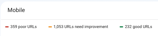
Our site speed (Core Vitals) is poor.
Our schema is lacking.
Our page experience – yikes:
Examine v2 moves to solve all those issues:
- Revamped content (FAQ-based) splits the content away from one enormous page.
- New codebase speeds up the site.
- New codebase fixes up schema issues.
- New design fixes the page experience.
It’s a lot of work to figure out the details
Health is messy. Trying to organize the human body, the various things that can impact your health, and all the ways of talking or even measuring health is exhaustingly complex; here are a million edge cases.
So while we knew the big picture of what we needed to do, figuring out the details was incredibly difficult.
Huge props to Kamal and the research team for discussing every single detail ad nauseam.
Even our hierarchy of health:
It looks simple, but it took us hours and hours of conversations about “what if X happens?” or “what about Y symptom?” or “have we considered Z marker?”
Even today, we are still a bit unsure if “health outcome” is the right word or if something like “health marker” or “health parameter” fits better. And it’s not just pedantry – we also need to consider the implicit usage when discussing these things!
There’s a reason why pretty much no one else does this – the human body is a sordid mess of interconnected systems and layers, and trying to relate this information and give it organized structure has been… challenging.
Almost all sites do what we do right now – “here’s a bunch of health topics, good luck!”
Examine v2 will feature ~25 categories, 85 conditions, and 400 health outcomes. We have to map all of them, and it’s rarely straightforward.
For example, our current system has “blood pressure” as a topic. But in Examine v2, “high blood pressure” and “low blood pressure” are conditions, and then “blood pressure” is an outcome. But what about systole and diastole – how do they come into the hierarchal setup?
Our current information structure nor our current design can handle these changes.
Fundamental changes were required
Our customer research sealed the content side – we were not providing content how our users wanted it. Our users loved that they could trust us. They loved how annoyingly “above the fray” we were. They loved that we focused exclusively on the evidence.
(Well, 99% – some people got upset by our Inequality is a public-health issue: 10 examples article).
But we were failing to bring it all together coherently. The site was a mess; users had to work to get what they wanted, which was a fail.
And if we had to re-do how we presented the information (and integrate all the various parts), that also meant we needed a new design.
And we tried to retrofit the existing codebase, but it was incredibly messy to do so. So okay – we needed a new codebase.
So we needed to:
- Re-do our content
- Redesign our site
- Re-write the site codebase
So inductively, we arrive at Examine v2.
Going through the process, I don’t see any way we could have done this piecemeal because of one simple truth:
Everything is interconnected – you cannot do one without the others.
I love Examine – the idea behind it, the people behind it, and the content we create.
But I’m also embarrassed by the Examine site – it’s hard to use, the information is difficult to find, and it can be way too overwhelming.
RFP for our New Site
The current Examine design had come together in a piecemeal/duct-taped fashion. When we first released the design years ago, there was no web-based NERD nor Supplement Guides, and Study Summaries was just an idea.
We’re all about “let the experts do the work,” and we wanted to make sure we went exhaustive to find the right partner to help us bring Examine v2 to life.
Due to the large amount of change happening, we wanted to bring in someone with the proper sensibilities that would:
- Understand what made Examine unique
- Understand the complexity of information that has to all appear interconnected
- Have the understanding of how to design individual pages and have them come together in the big picture.
We effectively needed a partner, and ideally someone already familiar with Examine.
I also did not want to use 99designs or anything similar for two primary reasons:
- It has a very hunger games vibe; having creatives do free work seems wrong.
- The complexity of the new site meant we needed someone focused on it, not just trying to throw something flashy that would catch our eyes.
So to find the right designer, we had to put out an RFP (request for proposal).
So uhh, how do you RFP?
I have to admit – I had no idea where to start.
So I did what I usually do: I turned to my friends.
I’m part of a community of entrepreneurs called MMT (run by my good friend Jayson Gaignard – it’s his birthday tomorrow!), and I posted the following:
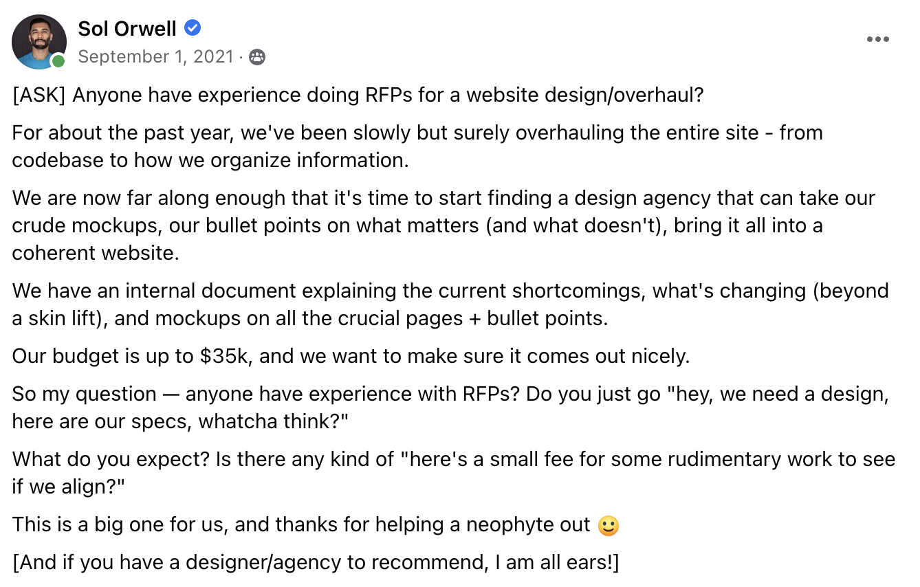
The immediate suggestion was to talk to Chris Yoko, a friend who owns a design agency. We quickly got on a video call, and whew, Chris laid it all out for me.
I want to take a moment to make two essential side points:
Your reputation matters
When I met Chris years ago, I didn’t know I would be in a position where his knowledge would benefit me. I didn’t know he would be “useful” to me in a business sense.
All I knew was that Chris was a nice easygoing guy (his latest project is helping businesses offset carbon on behalf of their employees), and we got along great. When I went to DC, I saw him. He came to my Cookie Offs.
Because of our prior relationship, I could go in to “pick his brain.”
I’ve said this a million times, and I will repeat it here:
Having someone on the other side is incredibly helpful
What made Chris so helpful was that he had not only crafted RFPs but also responded to many of them.
He had been on the other side, and he knew what you would find in a good versus a crappy RFP. He had experience dealing with customers based on their RFP, so he could give me clear guidance on what was helpful and what was not.
This kind of “insider” information was critical in helping us set ourselves apart from everyone else.
What do you find in a good RFP?
Instead of boring you with text, I’ll outline the major parts:
RFP Document
The goal here is to ensure they comprehend what you are trying to do and why you are trying to do it. The more they understand the entire setup, the better job they can do responding to what you need.
- The more clarity, the better. Erring on the side of over-communication instead of under- is preferred; explicit always beats implicit understanding.
- Include the mission at the top; it cements what you are really about and what matters to you.
- Add in a honeypot to make sure they correctly read the RFP (e.g. why Van Halen asks for brown M&Ms)
- A simple example is to ask them for their favorite “X” – it’s low effort on their part, and if they don’t do it, that’s a big strike against them.
- The site’s tech stack.
- We intended to use bootstrap, but we shifted to tailwind; other companies can even help suggest modifications to your tech stack.
- Have user stories/personas.
- Outline the journey each persona goes through when interacting with your website
- You are effectively clarifying your funnel.
- How they find us, how they use the site, what they find useful, what would make them upgrade, etc
- This helps the responders understand what matters and how the interactions unfold.
- Outline the journey each persona goes through when interacting with your website
- Mobile experience expectations.
- Requirements for the applicants.
- e.g. “Have previously created a health website.”
- e.g. “Understand complexities of health taxonomy.”
What to Ask for
The goal here is to be very clear with the timeline so that everyone knows when X or Y is expected of them.
- There are multiple dates you want to set:
- An “intent to bid” date is the latest you’d like to hear back from them that they will respond to the RFP.
- A date for all questions to be sent in
- This lets you see their attention to detail.
- Note that you will collect all the questions and send the answers to everyone involved.
- Date for selecting finalists + ask for references
- Make sure you check the references
- Date/timeline for when you will interview
- When you will notify them if you did not pick them
- Date for when you will make a final decision and want to start the contract process.
- Be as transparent as possible in the RFP
- Timelines
- Budget
- Can also potentially do a level of contingency based on success metrics
Measuring Success
This is arguably more important for you than anyone else – again, we’re setting expectations and being able to track the results of the work you need.
It’s harder to improve things if you cannot objectively look at where you are and wish to be.
- Project
- Deadlines
- Outcome:
- Quantitatively:
- SEO Traffic
- Site analytics
- Heat maps
- User engagement
- Performance
- e.g. “2 seconds to first contentful paint.”
- Surveys
- NPS
- PMF Survey
- Qualitatively:
- Surveys
- Customer Research
- PMF Survey
- User stories
- Quantitatively:
RFP Expectations
Previously, we’ve communicated what we want; now, we tell them exactly what we need. Making sure everyone is aligned on deliverables is crucial.
- How do you want the design done?
- Does it matter to you?
- What is the final delivery you want?
- PSD
- CSS/HTML
- Developed frontend
- Set constraints
- e.g. “X # of rounds of revisions are included.”
- References
- Examples of work
- More consultative people vs. straight-up design
- Designers will be priced lower, but you have to push and be the expert
- Ideally, experience in the same area – structure, conversion, information density
- e.g. “I create amazing landing pages” – that’s great, but not be what you need.
- Limit to X # of relevant examples.
- More consultative people vs. straight-up design
- Agreement on success metrics
- Honeypot, as mentioned way earlier
Easy way to filter:
- A couple of questions and a video to clarify
- You don’t want someone who YESes everything you suggest
- You don’t want a “whatever you want” person
Steps once hired
We needed to create an action place once everything was agreed upon.
- Discovery – they need to understand what you are doing and what you want
- What is organizational success
- What do our personas wish to accomplish, user stories
- Customer research
- Wireframe
- Pageflow map
- To see how a user goes through the “funnel” on your site
- Pageflow map
- Design system
- Much easier nowadays with CSS frameworks
- Aligns the aesthetics across all pages
- It gives the user visual clues
- Design pages
- Layer in copy for prototypes
- High-fidelity mockups
- E.g. via Figma
Creating our RFP
The entire process is a lot of work. But the adage of “a penny now or a pound later” applies here.
(As with most things in life).
But beyond the design element, creating the RFP document was critical for a simple reason:
The RFP document ensured that Kamal and I were aligned on Examine v2.
Kamal has ideas. I have ideas. And we often disagree. Going through this entire process ensured that we could hash out all of our disagreements and get on the same page with each other (and the team), especially with so much changing!
This process took us a few weeks. It wasn’t enough to paint the broad strokes; we had a lot of details to figure out.
For example, the primary generators of revenue on Examine are:
- Study Database (via Membership)
- Study Summaries (via Membership)
- Supplement Guides
All three have three separate processes, and all three are in distinct areas of the website. And so – how do we merge them all? Both process-wise and content-wise? Can we embed parts of the Supplement Guides into the Study Database? How do we interlink so the user can find exactly what they want?
We had a lot of things to figure out (even today, 40 days away from launch, we keep coming up with annoying edge cases!)
Furthermore, it was crucial in helping the team understand all of the issues we had identified with Examine and how we wanted to fix things.
(We could have done a better job; I’ll cover that in a subsequent week).
Our RFP document ended up having four main areas:
- What we were looking for in an RFP
- The current shortcomings of the site
- How we were going to revamp the content
- The elements we needed for each page
We set expectations, covered the problems, how to fix those problems, and what we needed on the pages.
We did go one step further – we created some simple wireframes to show what we were thinking; it’s pretty cool to see how much we’ve evolved:
The entire RFP ended up being 30 pages long. It was quite detailed, and we often heard, “This is the most detailed RFP we’ve ever seen, and it’s about as clear as things can get.”
Eventually, this document morphed into our Examine v2 Design Document, which we’ve used to keep the team aligned with the ongoing changes since we started the entire process.
Our Actual RFP
Here’s a link to our actual RFP. The existing Examine v2 Design Doc is significantly different, but I’m glad we have this archive from the past.
Looking for an agency
As always, a strong network comes up in the clutch.
My first order of business was posting on social media (FB, LI, and Twitter), asking for any referrals. I also posted in some private groups I’m part of (eg, MMT that I had just mentioned earlier) and pinged friends I knew who talked about design, UX, or recently gone through a redesign.
Finally, we went out and just started googling healthcare agencies.
We were very clear about our boundaries from the start – a few of the big ones:
- What our budget was (up to roughly $75k)
- Our general deadlines
- That we were not expecting free work (a serious issue for creatives)
The above, coupled with our detailed RFP, set us apart – we were not coming in wishy-washy, and we also showed respect for their work.
I also set up reminders to do at least one follow-up if someone did not reply.
We asked for:
- A 1-2 minute video of a quick informal analysis of Examine.com. We just wanted to see what they picked up on as they browsed the site.
- A quick sketch of how they could see the information connecting.
We figured this was 20 minutes of work (an acceptable request) and would let us see:
- Their thought process (video)
- Their work process (sketch)
The ones who said they were not going to respond to our RFP had two general reasons:
- The deadline was too soon
- The budget was too small (the larger firms all basically start at 100-150k+)
The honeypot paid off immediate dividends – I did not expect someone to get every detail right in our massive RFP. Still, when people asked basic questions that were answered right on the first page, it was a strong signal that they were not as detail-oriented as we were looking for.
We got fewer clarifying questions than anticipated, and I’d chalk that up to our expansive RFP.
We ended up on about a dozen meetings, and in all honesty, it was mostly not worth it. Most of them gave us the spiel about what made them special, but most of them said similar stuff at the end of the day. It was a bit too jargony for me – customer-focused, deep research. I was personally far more interested in examples of how they did their work.
We used our network to find potential agencies and communicated our expectations.
Ranking the agencies
Anytime I have to decide between competing parties, I tend to throw all the applicants into a spreadsheet and start figuring out what to rank them for.
Some of the attributes we ranked:
- Understood RFP requirements (six different variables)
- Initial gut reaction
- Longer analysis
- Process of design
- Video analysis
- Sketch work
All of the above were either rated as yes/no (RFP requirements) or ranked 1-5. Kamal and I did this independently, and we tried to blind the RFPs to minimize bias towards any specific group or individual.

We had 27 applicants, and this method was critical in being as objective as possible.
After a lot of back and forth, Kamal and I settled on five. It was tight – some had more experience, some had more unique approaches, etc.
We ranked all the agencies on various attributes to be as unbiased as possible.
Hiring the “best” person
I want to take a related tangent: the entire idea of the “best” hire.
“Just hire the best person.”
I hate this phrase so much (you’ll often see it in conversations around race and gender).
Having done this for a few decades, I can confidently state that it is a blue moon event to have an explicit “best” hire.
Like most things in life, you always have trade-offs in your applicants – someone who has more experience but is not as tech-savvy.
You may have someone who may not have the highest output but is fantastic at building culture.
You may have someone with a lot of enthusiasm and energy, but they may be asking for a higher salary than you are looking to pay.
Everyone has strengths and weaknesses, and there are always trade-offs. So the next time you see someone talk about “oh yeah, just hire the best person,” please note that they are full of it.
There is rarely a “best” hire – similar to the real world, there are trade-offs.
So with us having whittled it down to five, the internal debates began. What variables mattered more? Who seemed more competent? Who best understood our mission and could deliver what we needed?
We involved a few other employees and whittled it down to three.
We pared down 27 applicants to three finalists based on our rankings and internal discussions.
The Final Round
All three of the finalists had clear strengths and weaknesses.
For example, two of the three finalists were already Examine users, so they had a better understanding of what we were looking for (in fact, one of them had emailed me years ago about a negative user pattern we had!)
The same two were also smaller than the third, so they did not have as much expertise to pull.
One of them had just built a health/fitness app, so they were most attuned with what we were looking for, but they were also running it, so their time estimation was the longest.
As I said: there is no single “best hire.”
So after a final round of meetings with the three agencies, we rated them across the following (adding up to 100):
- Details (30)
- Approach (20)
- Tech knowledge (10)
- Team XP (10)
- Portfolio (10)
- Price/timeline (10)
- Ease of working with (5) [everyone got a 5]
- Misc (5)
We ended up with a clear Top 2, and at this point, we had to make a gut call.
We ended up going with Tamba. One of their principals (Hamza J) was the one who had emailed me years earlier about a thing we had to fix. He had sold his previous design agency to someone I knew, and that person only had rave things to say about Hamza J (funnily enough, that same person had a design firm he owned bid on our RFP).
We ranked the three finalists across multiple attributes before finally picking Tamba.
Design in action
After Tamba was hired, we had a few conversations to ensure they fully grasped how interconnected Examine v2 was. Afterward, they gave us a more organized timeline on when they expect the various deliverables and milestones.
Overall, the process was smooth. The Tamba team would work on something, show it to us on Figma, and we’d have a weekly chat on where things were going.
These meetings were long, and there was a ton of back-and-forth, but Hamza J (and his partner Hamza G) never made us feel like we were being too annoying (hey, that’s who we are)!
The Tamba team was also very accomodating with the reality of our work – the content simultaneously with the design. Many modifications were needed as we discovered issues by creating content for Examine v2.
Our current internal Examine v2 Design Document is fairly different from our original RFP, and the Tamba team was incredibly helpful in getting things sorted out.
In retrospect, we should have had longer timelines and built-in more time for revisions – the v2 content and the v2 design could not have been done independently, and we should have planned for that.
Overall, Tamba was a partner that worked out very well for us, and I am excited with the result:

Growing up as a company
Before I get into this part, I want to restate my caveat from the beginning: this is from my point of view. Kamal was critical in all of this, and he and I generally have worked towards the same goals, and none of this would have been possible sans Kamal.
Flattening the company
Back in January 2020 (pre-COVID), soon after Examine’s financial crunch, I was introduced to Tim Masson, a big fan of holacracy. He told me to read the illustrated version of Reinventing Organizations.
Now, I was already familiar with holacracy; not just because Zappos had made it trendy but also because my friends over at Precision Nutrition had implemented it and were strong proponents.
The quick version is that holacracy eschews typical top-down management and instead assigns roles and lets people self-organize around whatever the company needs to get done. Effectively, you eschew managers and let the people doing the work figure out the best way to do the work.
In January 2020, Kamal and I both agreed that flattening the organization was the way forward — we’d previously had an operations person but had found that it had only added an unnecessary layer to internal communications. Examine was Kamal and I and the team — no need for a layer of management at this point.
This flattening let us distribute some of the decisions to be made. I’ve tried to tell my people, Hey, I don’t care if you make a mistake. I care that:
- You had a reason for what you were doing
- You learned from your mistake and don’t make it again
It worked for us for one critical reason: the people we hired were awesome.
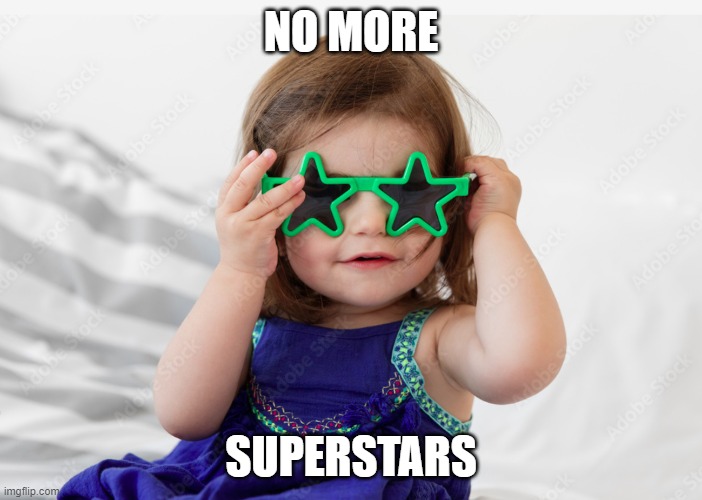
And when I say awesome, I mean as humans. I no longer subscribed to the cliché “hire superstars and let them do what they need to do.”
If you aren’t nice, I have zero energy for you. I wanted to build a company where I enjoyed engaging with everyone. You could be the world’s most brilliant and productive person, but if you’re an ass, you ain’t working for us.
So if we have awesome humans who are also smart, why would we need to micromanage them? As long as they get the work done and communicate well with each other, things will work out.
This does not mean blind trust.
You don’t constantly look over people’s shoulders, but you keep track of what’s happening (and what should be happening and isn’t). Give people the leeway to do things on their own, to do things their way, but definitely spot-check that the work is getting done correctly.
Trust, but verify.
Hire intelligent and friendly people and empower them to make decisions.
Tell them why

As our 2019 financial woes became less dire, I hired a developer who’d worked for me way back in 2003 (for the nerds, I remember us both learning CSS when it started going mainstream).
It almost felt like I had to reset his work mentality because he was used to being treated as an unthinking machine. He was used to being told what to do, with no explanation, no why, no what for — merely a cog in the machine.
His employers had all been stupidly shortsighted.
Over the past few years, we’ve tried to explain to the team why we are doing this or that. For the extra 10–20% effort it takes us, we now have our employees looking at things critically and asking themselves, “Is this the best way to achieve our common goal?”
I will admit, it can be tiring. Sometimes you feel like you’ve explained the same thing a dozen times, and someone says, “Nope, I do not recall this.”
And reading this you may think I’m blaming the employee, but nope — that falls on me (and Kamal). Our job is to lead the team, and our responsibility is to clearly communicate where we’re going as a company.
Kamal and I chat every week. We have our ideas and are generally in alignment with each other. Getting those ideas out of our brains and into something that can be shared (written words, visuals, whatever) is critical, and I’m always trying to get better at it.
At Examine, we don’t overload people with meetings (I average ~3 a week, one of which is with Kamal); thus, it’s critical we communicate so the team stays in sync.
In the earlier section on our RFP, I linked to our RFP document and mentioned how much it had changed; but it didn’t change all at once. It changed progressively, bit by bit, “in real-time,” so the entire team would always stay on the same page.
I’ve also started talking about where I want to see the company in three months, in six, in twelve.
Having someone understand why you are doing something empowers them to do far more.
Talking about everything
Letting everyone know the why of what we’re doing led to many discussions, explanations, clarifications, and debates. And no one can debate as nerds can; I’m pretty confident in saying that very few companies discuss the hell out of things like we do.
One of my marketing challenges is to effectively convey how particular we are.
For example, we must have spent over 30 hours discussing naming the third level of health topics. We went back and forth between words like Parameter and Metric, and even surveyed our users (then had to read nearly a thousand responses), before settling on Outcome.
I can also understand why someone may think this a waste of time or even a nightmare, and that’s cool, I get it. But I do think that this investment of time and effort yields higher employee engagement, better results, and in the end, a much better product. It adds a very inclusive spirit to all that we do.
As with anything in life, there are trade-offs. The positives are huge: when everyone gets a say and has a vested interest, we usually end up with the best decision. There are downsides too: it slows us down (which chafes me, since I’m a do-er by nature), and we can sometimes overthink things.
90% great, 10% grating. 🙂
As our team grew to 30 plus people, it became easier for us to get bogged down.
Our solution was to create a traditional org chart, and assign team leads.
The team leads are not managers. They’re not hiring or firing anyone. What they are is responsible for corralling the various viewpoints, and they have the autonomy and authority to make a decision — to break a deadlock and move things forward.
We effectively open up all things to discussion, which helps with buy-in and gives us a far more robust product.
Make your employees feel safe
I think a lot of people misinterpret employee safety as “you cannot say anything that may offend [the snowflakes]!” But no. Making someone feel safe is giving them the ability to speak their mind without fear of reprisal — and a ton of data show that if you do that, you increase productivity (among other benefits)
When you hear “There are no dumb questions” or “If you have a question, there are usually ten other people who have the same one” — what it really means is “You can speak freely, without fear or sounding stupid or making someone angry at you.”
There’s no debate without the freedom to disagree, and it’s critical to ensure that everyone can disagree without fear of reprisal and without making other people feel threatened. It must always be clear that what is critiqued is a position, an idea, or a suggestion, not the person behind them.
And you know a crucial part in making this work?
Nice people. And not fake nice, but actual friendly people.
And the emphasis on the why helps ensure that people understand what we are trying to do.
Divas or jerks would have made all I’ve described above impossible.
I won’t pretend we’re all enlightened monks living in some nirvana where no one ever gets on anyone else’s nerves, but honestly, interpersonal frictions are at the bottom of my and Kamal’s list of concerns.
People want to be heard and respected.
Elevating the company
I am ambitious. I tell our team I want Examine to become ubiquitous.
Imagine it’s 2010 and you tell someone to Google something and they tell you they don’t know what you mean — you’ll think they’re jesting, or being purposefully obtuse!
That is the response I want from anyone in the health industry when it comes to Examine.
But that’s not even really what I care about.
What I really care about is building a company people love to work for. The kind of company I would love to work for. I want our employees to hear their friends bitch about their boss or pay or work and think, “Whew, I’ve got 99 problems, but my job ain’t one!”
(Similarly, when it comes to customer service, I always advocate treating our customers as we would like to be treated.)
Finances
One of the first things we did as we flattened the organization was adopt financial transparency.
Every month we break down our revenues and expenses for the team. They all know how we’re doing, month after month, and what we expect the following months to bring.
Profit-sharing
And to give it all weight, we also share 20% of our pre-tax profits with our employees. I do think Kamal and I are smart, but we aren’t some magical creatures — if the company does well, it’s thanks to everyone on the team, not just us two.
Also, I’ve set things up so that the difference between the top and median incomes does not exceed 5 to 1.
Work is not life
I don’t remember in which order, but we implemented three types of forced days off each month:
- Any national holiday
- One Friday each month
- One “Recharge Day” each month
After a while, Kamal and I realized we were basically one day a month away from a four-day workweek, so … why not?
I have to say, I’ve loved it. Having that Friday off is perfect for getting personal things done, and having three full days off means that by Monday I am raring to go.
(Of course, as we do before making any such change, we discussed this one with our team.)
Give your people the spotlight
I’ve always found it weird when a company has only one person speaking at events (almost always the founder).
I love getting my employees noticed.
In the past month, we’ve had Bill Willis quoted in The New York Times and Wyatt Brown in The Guardian, while Nick Milazzo gave a great talk at CPSDA (Collegiate and Professional Sports Dietitians Association).
I get a little thrill every time I see this happen.
Take your work seriously, not yourself
We love what we do, but due to the nature of our work, we don’t always get to let our sense of humor shine through.
So internally, we have meme Wednesdays.
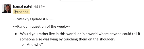
We have #weekly updates in which Kamal always brings up a random question that always leads to an interesting discussion (and, more often than not, to demonstrations of pedantry in clarifying the question).
We have occasional game days/nights to shoot the breeze and play Codenames (an excellent game for pedants like us).
I find “family” too hackneyed here — and I’d argue we get along better than many families do!
Don’t give lip service
One last thing: Companies love to talk about all the perks they offer … in theory. But they often make it difficult (or even discourage) their employees from actually using these perks.
For example, a company may ostensibly offer a four-day workweek, but actually frown upon employees who don’t work every day.
On the other hand, when we decided to try the four-day workweek, Kamal and I policed Slack to ensure no one was sending messages on Fridays. When we instated Recharge Days, we kept track of who had not used theirs yet and ensured they soon would. Likewise, after we offered a stipend, we sent a quarterly reminder to everyone who hadn’t yet availed themselves of it to do so.
Other companies offering benefits often remind me of gym memberships: they grant you access, but they’d rather you didn’t take advantage of it.
Treat your employees as thoughtful adults, and they will go to bat for you.
COVID as an example
Soon after we’d finally straightened out our financial situation, COVID hit, and we got walloped.
People thought we’d be crushing it (You guys are in health, right?), but they missed two things:
- Our largest customer segment — personal trainers and registered dietitians — got crushed by the pandemic.
- We sell information. If someone is worried about the future and trying to save money, one of the first things they will cut is information.
When COVID first hit, we lost about 40% of our revenue. And we communicated to the team our concerns, and the team rallied for us: many offered to take pay cuts or delays in pay, putting full faith in Kamal and me to do right by them.
And we did. We were able to weather the storm, and not a single person was paid less or late. And we try to proactively give out raises (above the level of inflation).
Treat your employees right, and they will have your back.
What is leadership?
My job is to lead the company towards something. We have a goal, a mission:
Examine analyzes and summarizes the latest scientific research to help you be healthier.
Next is the company culture. We have a handbook in which we:
- Set the guard rails on how we wish to achieve our mission
- Set the expectations of our culture
- Treat everyone on the team as an adult
(You can read a public version of our handbook here. It’s the same as our internal version, minus the details on how we use Asana, Slack, etc.)
This sets the expectation on how we work.
The next step is to ensure that everyone on the team knows our goals and to empower them to get us there. Whenever we hire someone, I tell them that it doesn’t matter if they’re new: if they see something that doesn’t make sense, they should say so! I also try to push them not just to identify a problem but also to solve it.
And again, I want to reiterate that it’s not like all of this runs perfectly or we’ve never made a mistake. We have an on-boarding checklist, and it seems like every time we hire someone we find something to add to it (we have reminders to follow up with our new hires 30 and 90 days in to ask them if we could have done anything to make it easier for them to integrate the team).
We’re always trying to improve and to empower our people.
People incorrectly equate leading with managing, whereas these are two different tasks that require different mindsets.
It all connects to Examine v2
I am confident we could not have pulled off Examine v2 without changing our approach and culture.
We’ve never really had issues with employees feeling like we’re jerk bosses (Kamal is a very considerate human, and I’m a data-based progressive). Still, we definitely had to refine our way of sharing our vision and ideas with the team.
As Greg tells us, we should minimize unnecessary heat generation (wasted/undirected energy).
Weirdly, COVID inhibiting our ability to meet helped drive these changes.
I should also add the caveat that my experience is very biased (similar to being on top of the mountaintop). It’s easy to go, “Oh man, things were rough back then, but now they’re all hunky-dory!” It’s very possible things were never as bad as they seemed and aren’t today as good as they appear — or that they are, but that we still have room to improve. And we certainly do.
Be it as it may, Examine v2 as a product could not have happened without rethinking how we approached managing — and leading — the team.
Growing Examine v2 would not have been possible without growing the team — and without the company growing up.
Lessons learned
I was going to outline all our missteps in this process, but honestly, there were far too many to count and track.
How we should have done things is likely more helpful to you.
Preparation
As you’ve read through, Examine 2.0 did not come out through some focused meeting or project – it was the cumulation of many steps we took to make our website more beneficial to the end user. As such, the process internally was quite ad-hoc – the three significant changes (new design, new codebase, and new content) all came about independently, and merging them was complicated.
What we should have done:
Bi-weekly meetings with the team where we explain what Kamal and I are thinking
We eschew meetings at Examine (I only have two scheduled a week). Kamal and I have one weekly meeting, but we frequently chit-chat via slack about how we want things to be.
A bi-weekly meeting would have been less “group chat” and more “Kamal and I are updating the team on the latest developments.” The team would then be encouraged to mull over what we were thinking, and they could come to us with their thoughts.
Having the team involved from the start would have made it easier for them to understand the complexity of Examine 2.0 and be much more on top of changes.
Org chart
I mentioned earlier that we did not have an org chart – it worked for us initially, but eventually, due to our size, it became an issue.
A clearer org chart would have helped us delegate the deep thinking to groups of people much more cleanly.
Most important things to note
In the RPF section, I noted how our RFP document eventually became our Examine 2.0 Design Document.
The problem is that the Design Document is… a lot. 36 pages of a lot (with another ~10 via the appendix).
We could have tied two key sections with our bi-weekly check-ins:
- Provide an ongoing “most important things to know” list
- A changelog on “how things have changed” every two weeks
This would have clarified the progression from where our ideas started to where we are today.
We should have communicated more frequently and clearly to the team as to the progress of Examine 2.0
The work
Overall / Content
The amount of work translating the content from 1.0 to 2.0 was incredible.
We had 17 major tasks on how data from Examine 1.0 was to be modified (a simple example: categorizing all the health topics into the new category/condition/outcome hierarchy).
The team has been working across multiple spreadsheets and documents and even folders organizing and writing up all the content we are modifying and adding.
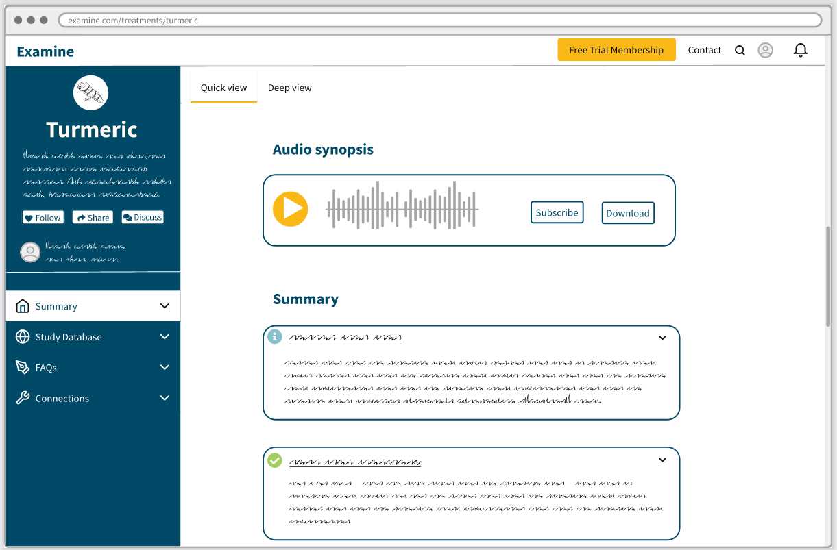
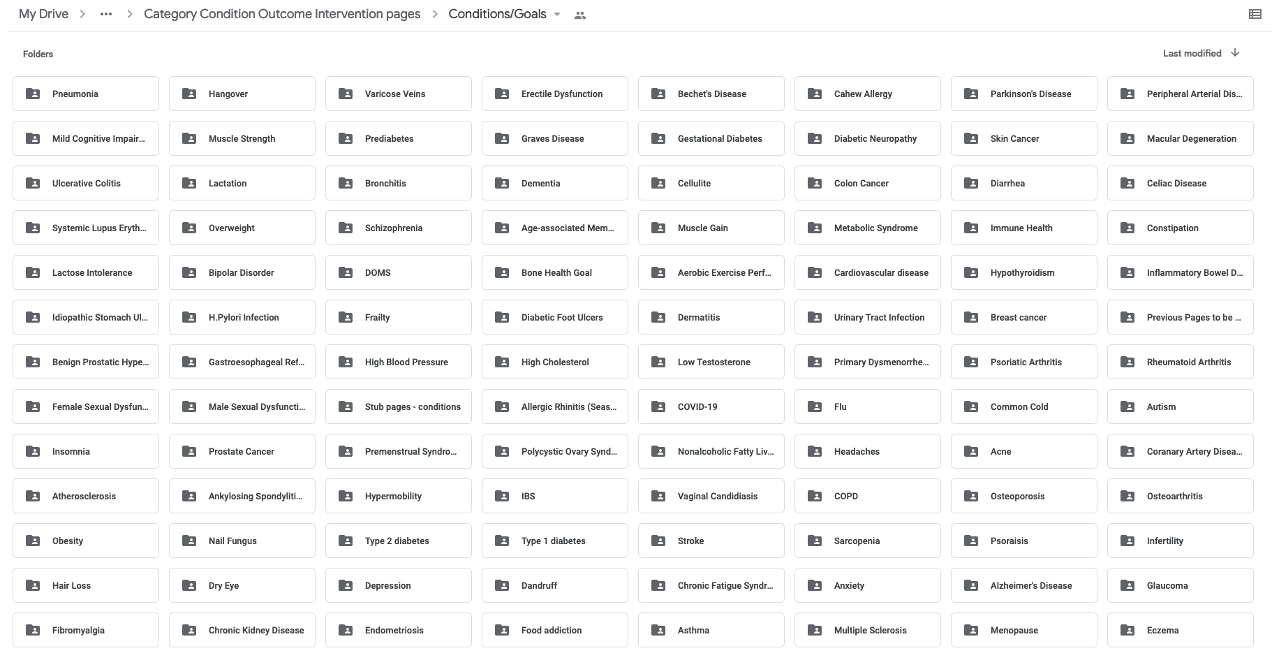
Here are our new condition pages, all written from scratch:
Getting all these different parts aligned was quite a headache.
The first thing we should have done is create a master spreadsheet that listed all the interventions and health topics (categories, conditions, and outcomes).
That spreadsheet would then have served as the central hub for all the content that was (re-)written. Everything would have flowed much easier if the central spreadsheet had been kept accurate.
This would have also allowed the tech team to build the various import functions a lot easier – the standardized spreadsheet would make it much easier for them to stay on the same page.
We should have also had our team leads have their bi-weekly check-in to discuss what they had worked on, what issues they were having, and so forth.
Again, this would have been merely to keep everyone in synch, which makes everyone feel more confident and aligned.
Finally, we had a lot of things to “figure out later” or “see how it looks when it comes together.” We should have had a place from day one to start storing the “deal with this later” issues as they came around.
Tech
We initially had committed to a plan of slowly rewriting the codebase. But considering our technical debt, we should have been more proactive in deciding “we need to rewrite everything from scratch.”
The other issue is a rehash of what I said – we should have involved the tech team on the content side from day one so they knew what was going on and did not experience any surprises later on.
Design
I was happy with how the design came through.
Two notable things:
- No placeholder text ever again. Due to our scientific nature, placeholder text caused a lot of confusion internally (and with users when we showed them). Any future RFP/designs will have a strict requirement to use actual text; any placeholder must be replaced.
- We should have kept a list of common design elements and normalized them. For example, we have a few different styles of menus, but the colors and styles should all have been standardized from the start; having the different types was confusing.
We should have done a better job ensuring everything was organized while the work was happening.
Release
No fixed release date
One of my biggest mistakes was trying to have a fixed release date. It was undue pressure that should have never been applied on the team, and it made us make decisions that ended up causing us more significant problems in the long run.
This also led us to take shortcuts – for example, search autocomplete was not ready when we went live.
Never again.
Longer beta
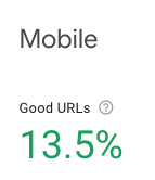
Our beta was roughly ten days long. We did a solid job identifying almost all of the significant bugs before release, but we missed a lot of small ones (especially on mobile).
User feedback
We should have created a group of 50 interested Examine users that we could have used to bounce feedback off quickly whenever we wanted.
We often sanity check internally, but due to our biases (especially with how nerdy we can be), having a group of users to who we could ask for feedback would have been incredibly useful.
Exhaustion
Close to Examine 2’s launch, I would wake up at 7 am and work nonstop until 11 pm. I was so exhausted by the end that I would lose my voice by nighttime… without having spoken to anyone!
Some of our employees also worked nonstop (they were compensated), but it still left a gross taste in my mouth (as it also impacted their plans for summer).
We had a lot of missteps on our path to releasing Examine 2. Lessons were learned, and we’ll avoid making the same mistakes twice.
My final update will be on what the future may portend!
Leave a Reply